ROLE
Sole Designer
Duration
16 Days
STATUS
Launched
Date
2026 / 05
CONTENTS
01
Background
02
Research
03
Strategy
04
Key Decisions
05
Impact
06
Reflection
Back to top
01
Project Background
1.1 Background
Product overview
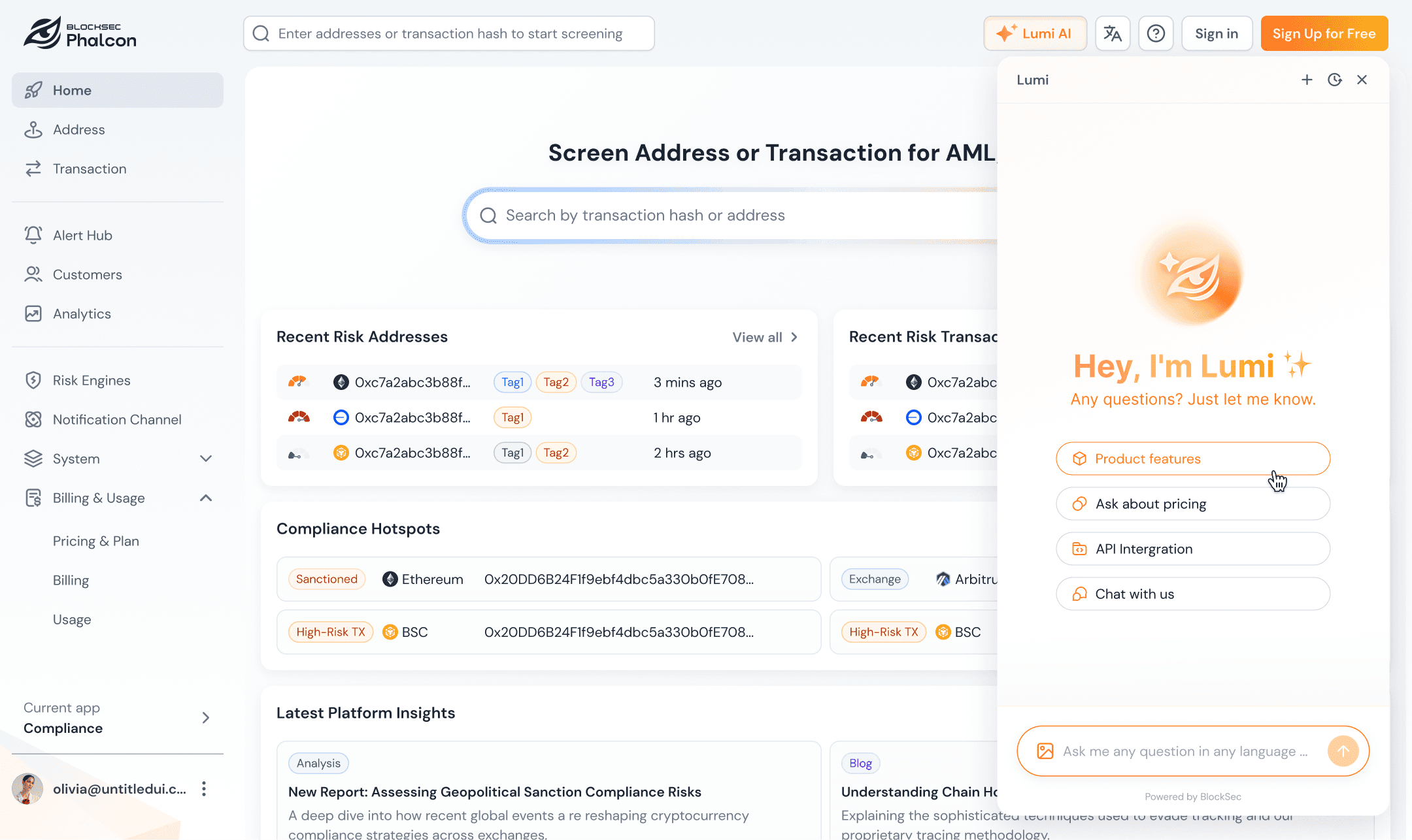
Phalcon Compliance is a crypto compliance and risk audit SaaS product under BlockSec. It supports address and transaction screening, ongoing monitoring, and risk reporting.Users include individual auditors, crypto-native teams, banks, exchanges, and compliance consulting firms.
b. Why we redesigned it


1.2 My Role
I was the sole designer on this project.
🔍 UX research
Claude code➡️ HTML(Interactive prototype)
🧩 Information Architecture redesign
🎨 Design System Updates & Enhancements
🔗 Cross-product alignment
🛠️ Developer handoff and QA
I designed the visual and interaction experience for Pricing Plans, Checkout, Usage & Billing, upgrade prompts, and Share Result management.The work covered Visitor, Credits, Essential, Scale, and Custom user states. It also handled key scenarios such as plan quota exhaustion, full Monitor capacity, Top-up, Renew, and Upgrade.


02
Research
2.1 Project Scope
Research object: The flow from viewing plans to purchase, usage consumption, renewal, upgrade, and shared result management.
Page scope: Pricing, Checkout, Usage & Billing, Upgrade Prompts, Share Result Management, and Migration Notification.
2.2 Identify Problems
Evidence sources :
User Research Data :
GA / Clarity Pricing data
Pricing / Usage / Billing heatmaps
Clarity session summaries
Real user feedback :
Telegram user group
In-product AI chatbot
Sales team
Problem 1 : Key Pain Points in the Old Pricing Experience
Key Metrics (Apr 20 - May 20) :
0.0 min
Avg. Time on Page
0.00%
Dead Click Rate
0.00%
Conversion Rate
Strong purchase intent, but difficulty choosing the right plan.
b. How these problems appeared in the product:

Price expression is unclear,
Users need to calculate it.
Free plan area is too large
and takes focus away.
Unclear CTAs and
visual hierarchy.
Important explanations are
buried at the bottom: low
visibility and easily missed.
Confusing Pricing Hierarchy
Current Plan Status Lacks Visibility.
Problem 2 : Current State Recognition
Click Heatmap of the Legacy Usage and Billing Pages (Apr 20 - May 20)


b. Common User Questions Collected via the Built-in AI Chatbot
How many screenings do I have remaining?
When do my credits expire?
Why do I need to buy additional credits if I already have a subscription plan?
c. Key Findings
Users had to piece together their account status across multiple pages and were often unsure whether to buy credits, top up, renew, or upgrade when they needed more capacity.
Problem 3 : Missing Long-Term Management
a. Feedback from Sales & Telegram Users
Wanted to locate reports that had been shared previously.
Wanted to revoke links that had already been sent out.
Wanted to know whether expired links could be restored.
Wanted a consolidated view of all shared links and their Active / Expired status.
b. Key Findings
While users can generate shareable links, there is currently no way to manage them. Users need to understand link status, view expiration dates, and have a clear mechanism to revoke access when needed.
03
Strategy
3.1 Design Principles
Turn plan selection from price comparison into usage-based decision-making.
Bring scattered account information into one understandable status view.
Place upgrade actions inside real limit scenarios, beyond the Pricing page.
3.2 Journey Structure
The final redesign landed as a complete self-serve payment journey, covering the key moments from plan selection, payment, account status, and limit triggers to expansion and long-term management.

3.3 User State Coverage
User State
Main Need
Key Pages
Visitor
Decide whether to start
Pricing
Free / Trial
Understand allowance and limits
Upgrade Prompt
Credits User
Buy more credits after usage
Pricing / Usage
Essential
Check subscription and usage
Usage & Billing
Scale
Manage higher allowance and Monitor
Usage & Billing
Custom
Contact sales and manage benefits
Billing / Notification
04
Key Decisions
4.1 Pricing Plans: Compress Complex Plans into a Two-step Decision
V3 introduced a more complex pricing structure: Plan, Screening tiers, and Monitor configuration all needed to coexist. I reduced the decision flow into two steps: choose a Plan first, then choose Screening and Monitor inside the card.
4.2 Checkout: Use One Order Structure for Multiple Payment Scenarios

I unified six different V3 payment scenarios under a single Checkout framework. The layout uses a two-column structure: order details on the left and payment on the right. For upgrades, users see only the changes being made. Immediate charges and future renewal costs are separated to clarify proration, credits, and renewal rules. Payment methods are also presented in a clearer, more streamlined summary.
4.3 Usage & Billing: Help Users Understand Allowance, Billing, and Next Actions
Usage and Billing were combined into one page with tabs, reducing the need to jump between pages.


Usage:Usage shifted from time progress to usage progress. For multiple allowance sources, the page uses tables to explain each source, expiration, status, and consumption order. The allowance consumed first appears at the top.Users can immediately understand how much usage they have left and what action to take next.
Billing:The Billing page strengthens visual hierarchy by placing the current Plan, Credits, payment status, and billing information in more prominent positions. The page keeps one primary Upgrade CTA, while Manage Billing stays secondary to reduce action fragmentation.
4.4 Share Result: Turn Shared Links into Manageable Assets
The key work for Share Result was to add management after link generation.
I added a Shared Results management page where users can see Active / Expired status for all shared links, search, copy, edit, bulk delete, and regenerate links.This turns sharing from a one-time action into a trackable asset.
4.5 Upgrade Prompts: Unify Upgrade Guidance and Give the Next Step by Scenario
I unified the visual and interaction structure of the upgrade prompt cards. Users remain in their current context and can continue viewing the page content, while upgrade prompts appear when a specific action is restricted. This helps users understand why an upgrade is required in a less intrusive way.
When users are close to reaching their quota limits, a banner provides a lightweight reminder and guides them to the next step.
05
Impact
Launch date: 2026.05.21
Comparison window: 2026.04.20-2026.05.20 vs early post-launch data
+0%
Registered users
+0%
Pricing page visits
+0%
Credits / Top-up Checkout
−0%
Dead clicks on the Usage page
+0%
Usage & Billing visits
What users and the team said after the redesign:
“It is easier to understand how much allowance is left, and whether the next step should be buying Credits or upgrading the plan.”
Telegram user group
“The state matrix and unified components make future Monitor, Top-up, and Upgrade scenarios easier to extend.”
PM / Engineering
06
Reflection
This project gave me a deeper understanding of complex SaaS payment journeys. Design needs to translate business rules, user states, and next actions into an actionable experience.
Key Reflections and Improvements
Design should enter problem definition earlier
Multi-state products need a matrix before pages
Growth design should measure comprehension, not only conversion
Component patterns should be defined earlier
If the work resonates or sparks your curiosity, I'd love to chat..
More Projects


© 2026 Tanya Tian